1) Navigate to the slide where you want to insert the charts, or create a new slide.
2) Click the Insert tab at the top.
3) Click chart
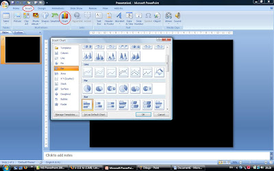
The insert chart dialogue box appears. You’ll see on the left a series of categories such as column, line, pie, etc. Click to select or you can scroll down using the bar on the right. Select the type of chart which is best suited for your needs. Click ok.
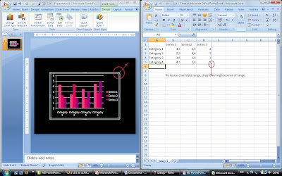 PowerPoint inserts a default chart into the slide, and opens an Excel worksheet. Click and drag the lower right corner of the worksheet to adjust the size of your data range. Change the descriptions and data to your requirements. I also presume you have some knowledge of Excel; if not, let me know. Knowledge of Excel is useful, but not necessary for creating charts. Whatever data you put in the worksheet, PowerPoint automatically updates the chart.
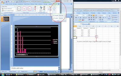
To increase or decrease the size of the chart in the slide, hover the mouse in a corner until you see a double-headed arrow. Left click. Without lifting your finger off the mouse, with your other hand press the Ctrl and shift keys together, and don’t lift these fingers off either. Drag the mouse until the chart is of the size you want. Alternatively, hover your mouse over the chart on the slide until you see a double headed arrow cross, then click on it. Click format, then size. Adjust the height/width.
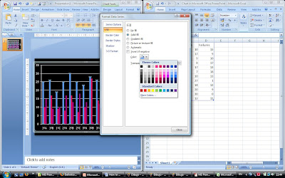
To change the colours of the bars, right click on the bar you want, and choose format data series or data point. Click on fill, then, solid fill and choose the colour you want.
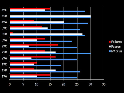 You may close the worksheet any time you like. To re-edit, right click anywhere on the chart and choose edit data. To change style of charts, right click and choose change chart type.
If you haven't got access to a projector, you can always print the slides.

No comments:
Post a Comment
Note: only a member of this blog may post a comment.